


Title: From Calm to Chaos: The Psychological Effects of Color in Our Lives
Subtitle: Exploring How Color Shapes Our Emotions, Behaviors, and Perceptions
Understanding Color Psychology
Color has a profound effect on human psychology, influencing our emotions, perceptions, and even behaviors. Throughout history, colors have been imbued with meaning, symbolism, and significance. The psychological effects of color extend into various realms—from branding and marketing to art and therapy. This article delves into how different colors evoke specific emotions and reactions, highlighting the spectrum from calm blues to chaotic reds, and how we can harness this knowledge in our everyday lives.
The Science Behind Color Perception
Color perception begins in the eyes, where light waves are filtered and interpreted by the brain. The human eye can perceive millions of colors. Researchers in the field of color psychology have found that colors can influence physiological responses and emotional states. For instance, studies show that people exposed to warmer colors, like red and orange, experience elevated heart rates and heightened arousal levels. Conversely, cooler colors like blue and green induce relaxation and even lower blood pressure. Understanding how our brain interprets these colors helps us see their impact on our daily lives.
The Impact of Different Colors
-
Blue: The Color of Calm
Blue is universally associated with calmness and stability. It is often linked to tranquility and serenity, evoking feelings akin to those experienced in nature—like a clear sky or a serene ocean. Studies indicate that exposure to blue light can facilitate concentration and productivity. Many hospitals use blue to create a peaceful environment for patients and visitors alike. As we have seen in various applications, blue promotes a feeling of trust and dependability, making it a frequently used color in corporate branding. -
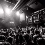
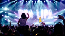
Red: The Color of Intensity
In stark contrast to blue, red embodies energy, passion, and even aggression. As a color that stimulates heightened emotions, red can provoke feelings of excitement or urgency. This is why it’s often utilized in marketing and sales strategies to draw attention to particular products or services. Red’s ability to excite and energize can also have some drawbacks—overexposure to red can lead to feelings of anxiety or danger, making it essential to use balance when incorporating this intense color into environments. -
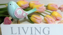
Yellow: The Color of Optimism
Yellow is often associated with cheerfulness, happiness, and optimism. Its brightness is reminiscent of sunlight and joy, fostering creativity and stimulating mental processes. However, overexposure to yellow can trigger feelings of frustration or anxiety. Therefore, it is best used in moderation, making it an ideal accent color in homes and offices intended to stimulate creativity without overwhelming occupants. -
Green: The Color of Renewal
Green symbolizes nature, renewal, and growth. Its effects can be soothing and restorative, often associated with feelings of tranquility and security. Studies have shown that environments featuring greenery can lower stress levels and promote a sense of well-being. It is no coincidence that many design strategies incorporate plants and green spaces to enhance mental health. -
Black: The Color of Mystery
Black is a color that evokes a range of emotions and thoughts. It is often associated with elegance, power, and sophistication but can also convey feelings of darkness and chaos. In fashion and branding, black carries a sense of authority and class. However, its overuse can lead to isolation or feelings of negativity, highlighting the necessity for balance in its application.
Color in Art and Design
The realm of art and design has long relied on the psychological principles of color to evoke specific emotions and themes. Artists strategically employ color choices to convey their intentions, guiding the viewer’s response. Colors can be used individually or in harmony to create mood and narrative depth. For example, a painting dominated by warm colors may evoke warmth and comfort, while those featuring stark contrasts or erratic colors may challenge the viewer’s emotions or perceptions.
In architecture and interior design, color plays a pivotal role in creating atmospheres that align with intended functions. For instance, a calming palette with soft blues and greens can promote tranquility in a wellness center, while bolder colors might inspire energy and creativity in a collaborative workspace. By understanding the psychological effects of color, designers can ensure their spaces resonate with emotional intent.
Color in Branding and Marketing
Businesses harness the psychological effects of color to shape perceptions and drive consumer behavior. Branding strategies frequently involve color selection, as certain shades can attract specific demographics while evoking desired emotional responses. Research shows that 85% of consumers make decisions based on color alone.
-
The Color Blue in Branding
Many tech companies, such as Facebook and IBM, utilize blue in their branding to convey reliability and professionalism. Blue, being universally favored, fosters trust and security among users. -
The Color Red in Marketing
Fast food chains like McDonald’s employ red and yellow in their branding to evoke feelings of hunger and urgency. These warm colors can trigger enthusiastic and impulsive purchasing decisions. -
The Color Green in Eco-Conscious Brands
Eco-friendly and health-conscious companies often use green to signal their commitment to sustainability. This color can evoke feelings of freshness and organic integrity, aligning well with consumer values. -
The Color Black in Luxury Brands
High-end brands like Chanel and Prada utilize black in their branding to convey exclusivity and sophistication. The use of this color suggests a premium offering, capturing attention while instilling a sense of desire.
Color Therapy: Healing Through Color
Color therapy, also known as chromotherapy, is an alternative therapeutic approach involving the use of colors to influence physical and emotional health. By exposing individuals to specific colors, practitioners believe that they can stimulate healing processes and improve overall well-being.
-
The Use of Blue for Mental Health
Practitioners often utilize blue light to provide a calming effect in various therapeutic settings, supporting anxiety and depression management. -
Red for Motivation and Energy
Red is frequently incorporated into motivational settings to instill vigor and enthusiasm, encouraging individuals to pursue goals actively. -
Green for Balance and Harmony
Green is often used in therapeutic contexts to promote emotional balance and reduce stress levels.
Conclusion: Navigating Our Colorful World
As we navigate through life, the colors around us play a crucial role in shaping our thoughts, feelings, and experiences. From the calming effects of blue to the chaotic energy of red, our surroundings are saturated with color, deeply influencing our psychological landscape. By understanding the psychological implications of color, we can deliberately curate our environments to foster desired emotional states, whether it’s seeking tranquility, inspiration, or productivity. Ultimately, embracing the spectrum of color empowers us to enhance our lives and navigate our emotional responses more effectively.
Footnotes
- Color psychology studies reveal varying emotional responses provoked by different shades, impacting mental health [Modern_Footnote].
- The connection between color and human physiology underscores the depth of color’s influence on our lives [Modern_Footnote].
- Historical significance of color perception can be seen across cultures, reinforcing the impact of color in communication [Modern_Footnote].
- Art and design leverage color significance to communicate themes, built upon foundational psychological principles [Modern_Footnote].
- Branding strategies are intrinsically tied to color symbolism, creating brand identities with emotional resonance [Modern_Footnote].
- The therapeutic implications of color are being explored in alternative healing practices, indicating a unique intersection of art and science [Modern_Footnote].


Add Comment